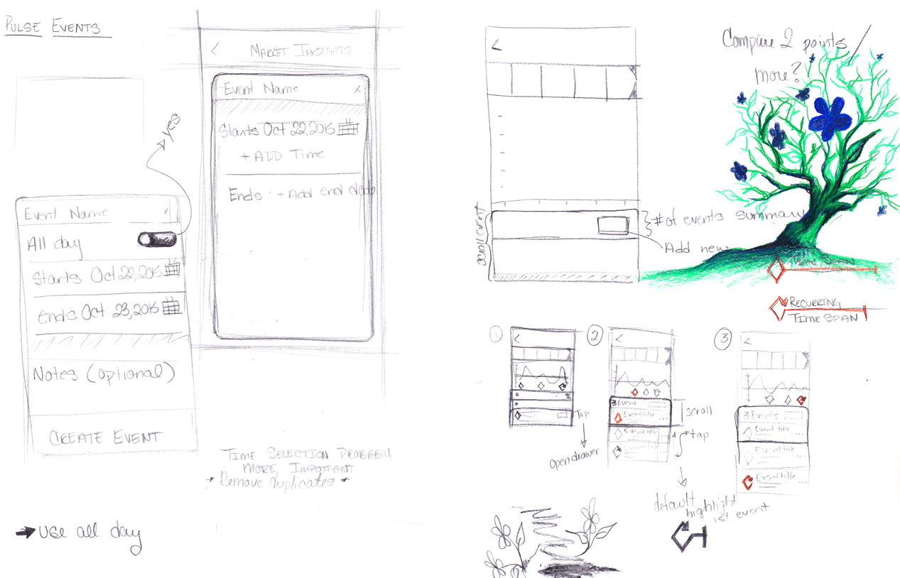
First Sketches and Mockups
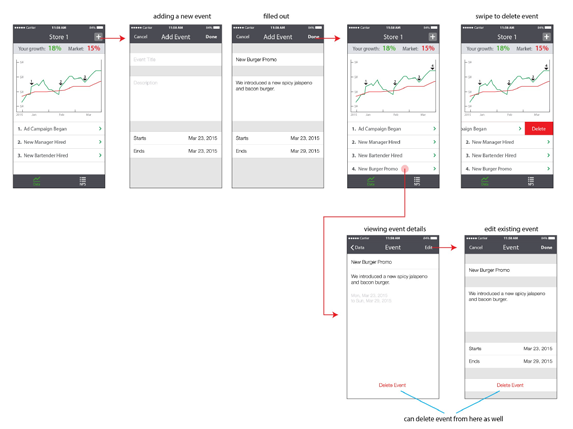
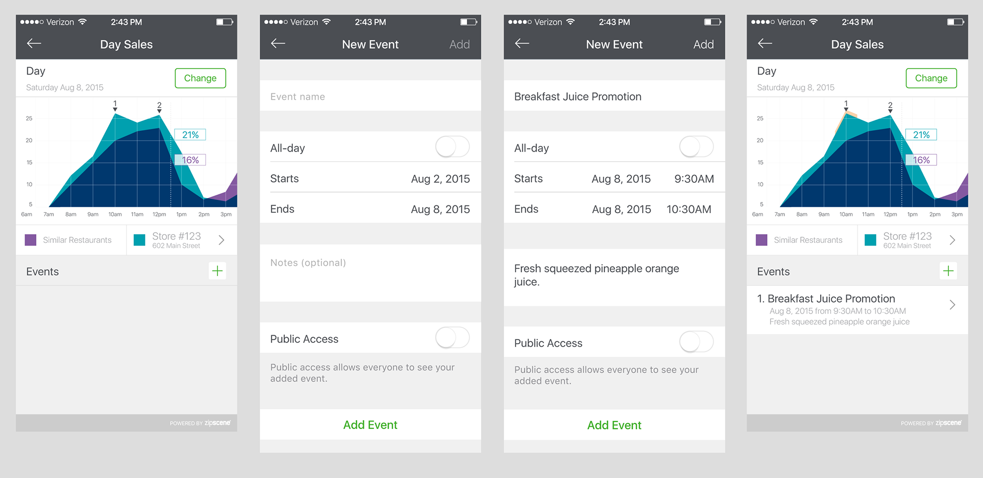
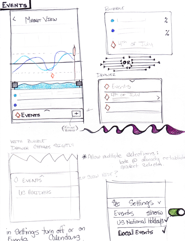
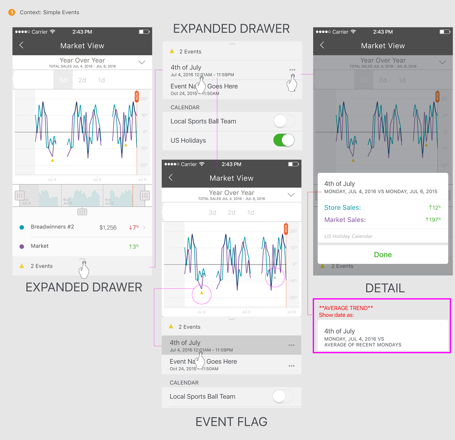
Adding Events into the Mix
Feedback from shareholders told us that people that frequent restaurants would like a way to see events (promotions, holidays, system down, etc.) The following examples show the first in-depth look at adding an events feature.
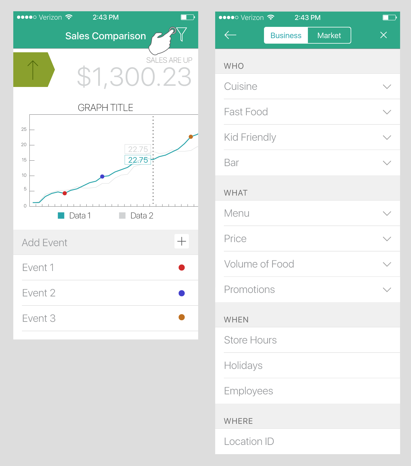
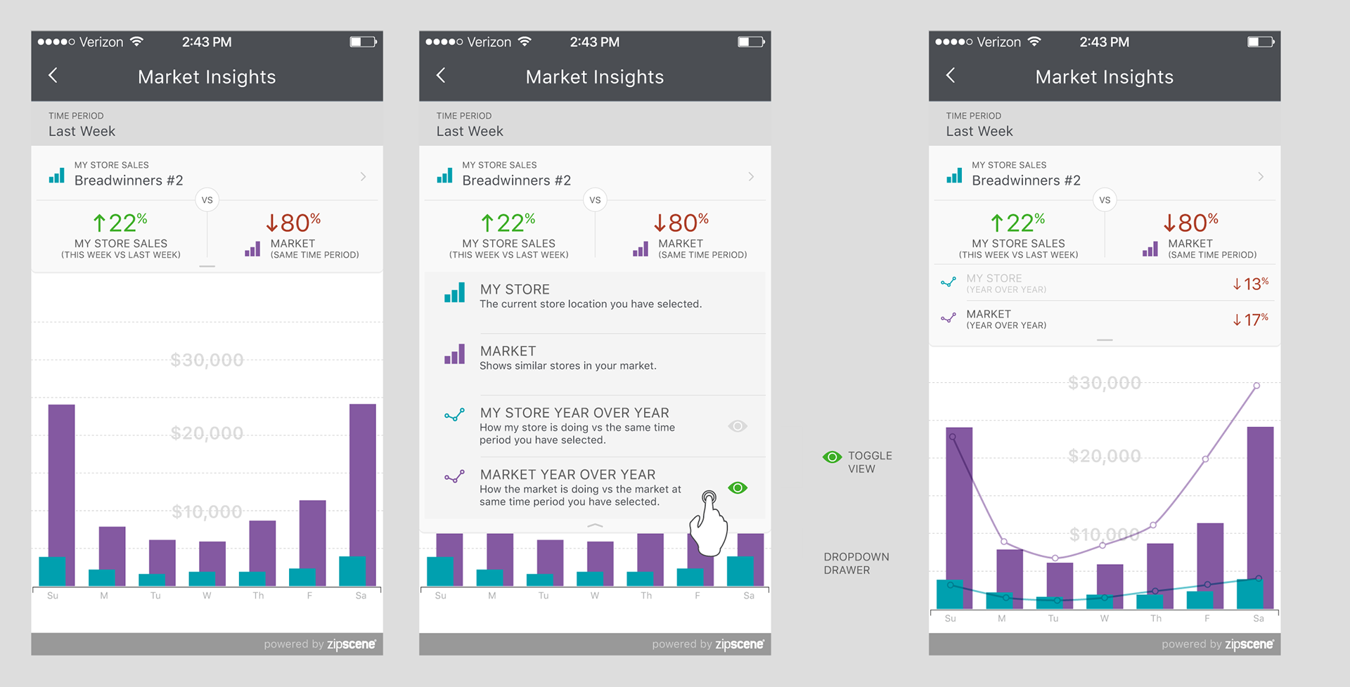
The Drawer
The drawer was a way to turn off or on features on the graph, so the user could choose what part of the data they wanted to see.

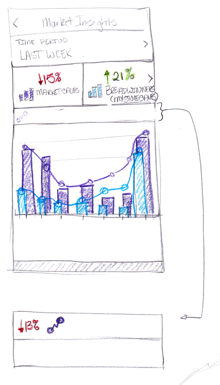
Taking the project on the road
At this point we needed restaurant feedback. We took the app on the road visiting the restaurant managers and owners the app. Valuable feedback was gleaned. We realized that we were trying to show too much in one view. People weren't sure what all of the metrics meant. We also realized that the area graph was probably not the way to represent the data accurately. A bar graph was adopted. Instead of 4 metrics being displayed in the graph we moved to 2 and removed the dropdown drawer.
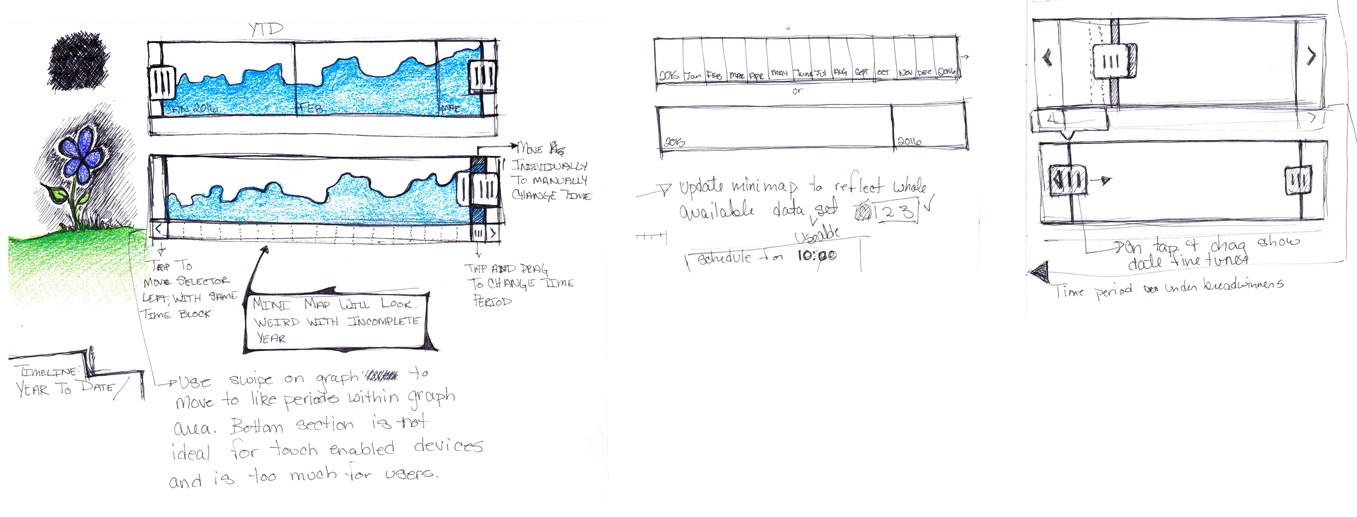
Mini Map
After much research and user studies, I quickly realized that navigating the graph was becoming complicated. It was difficult to know what part of the data you were viewing. The mini map gives you a view of the complete data providing context. It also allows you to quickly view other parts of the graph by tapping or dragging.
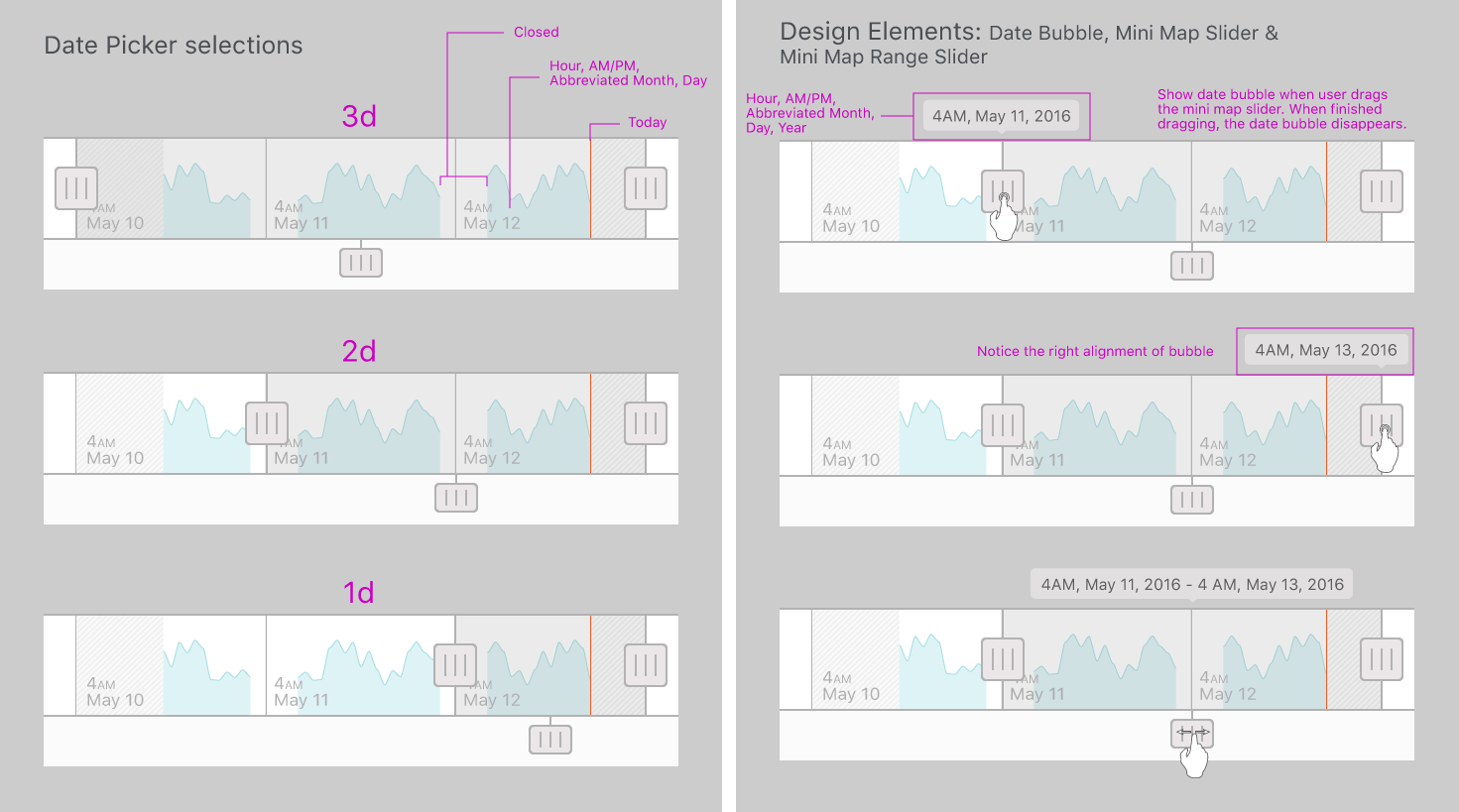
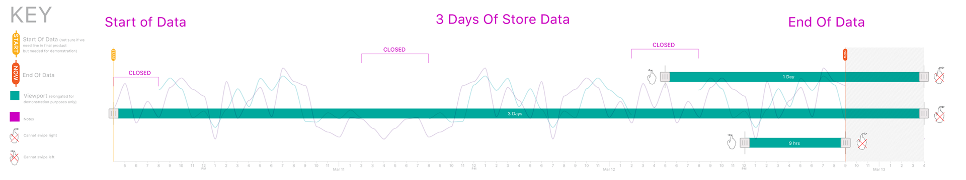
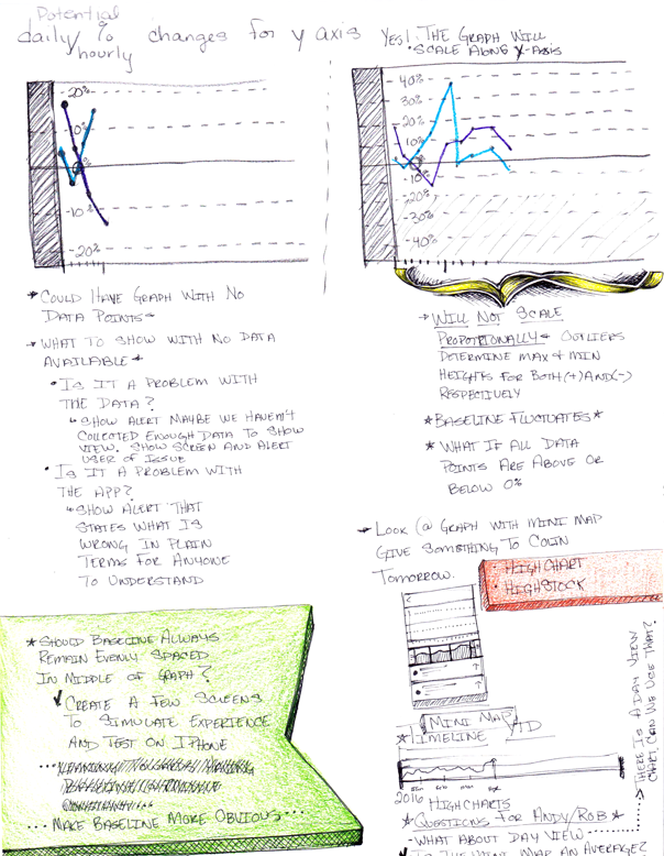
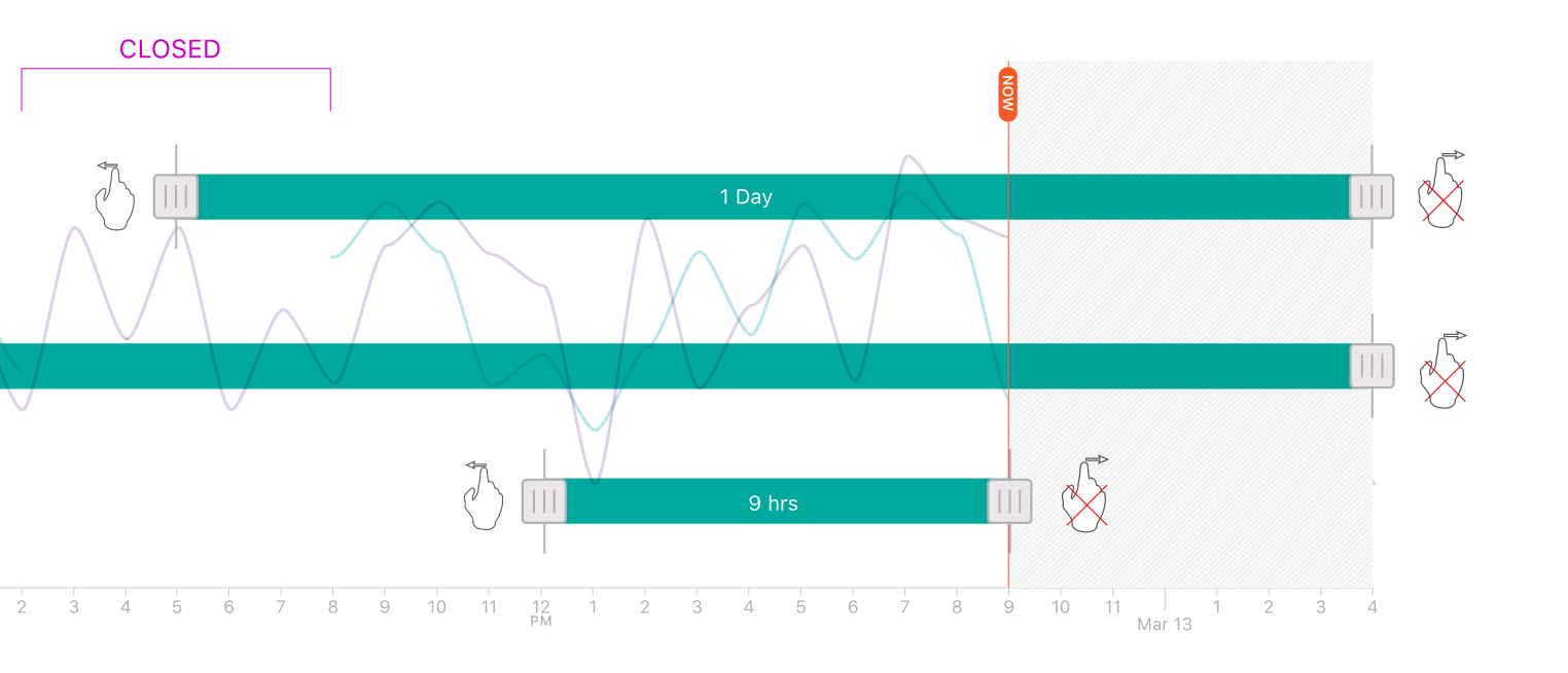
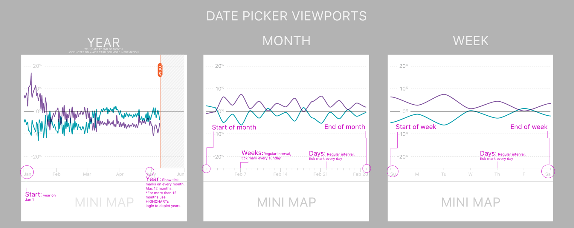
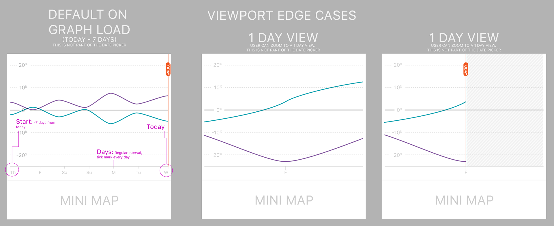
Exploring data representation along x-axis
I had to find a way to show what the UX would be for someone navigating the data. Below shows how the user cannot go further than the end of data or before data is available. Also shows what the graph looks like if there is missing data (restaurant closed, faulty POS, or servers down) by showing gaps in store data. Zoomed version below.
Expanded Drawer For Events
Using a drawer was one of the best ways to include the event feature in one view. Due to the nature of this being a web app where Zipscene did not own the navigation bar, a simple solution for one screen was needed. This image also shows the event triangle flag on the graph.
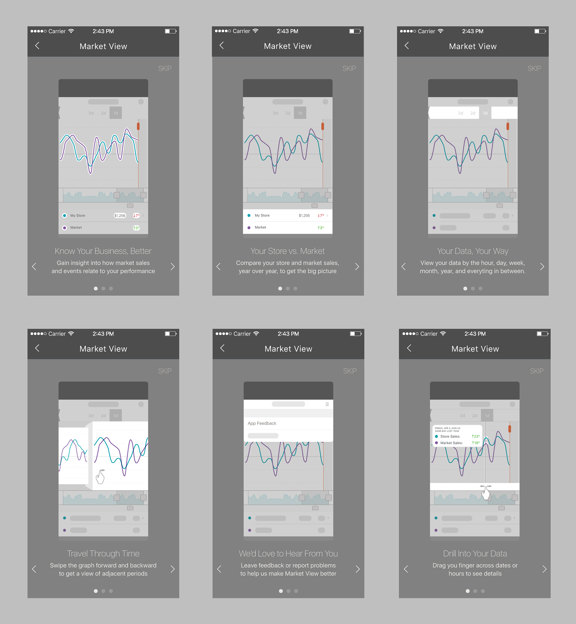
Tutorial For New Users
Through research I found that a bit of on-boarding was necessary for some users. This space served for a way to lightly educate new users upon initial app launch. The run-once format made sure that returning users would not be inundated with content.